Sweet Reply Event Branding & Design
My Role: Brand Development, Visual Design, Vector Illustration, Print Production
Project Duration: October 2025 – March 2026
Tools: Adobe Illustrator, Canva
Sweet Reply was a fan-run cupsleeve event with over 80 attendees celebrating NIJISANJI VTubers and White Day, a Japanese holiday associated with reciprocating Valentine's Day gifts.
*A cupsleeve event is a community-organized gathering where attendees receive custom drink sleeves and themed merchandise celebrating a character, creator, or fandom.
I led the development of the event's visual identity and graphic design from concept through production, creating a custom logo and extending the visual system across social media, promotional materials, and physical event collateral.
Visual Identity
Design Approach
The event needed a visual identity that felt celebratory and character-driven while remaining cohesive across promotional graphics, merchandise assets, and physical event materials. I developed a flexible visual system combining White Day motifs — letters, gifts, and sweets — with an expressive, illustration-driven aesthetic.
Logo Development
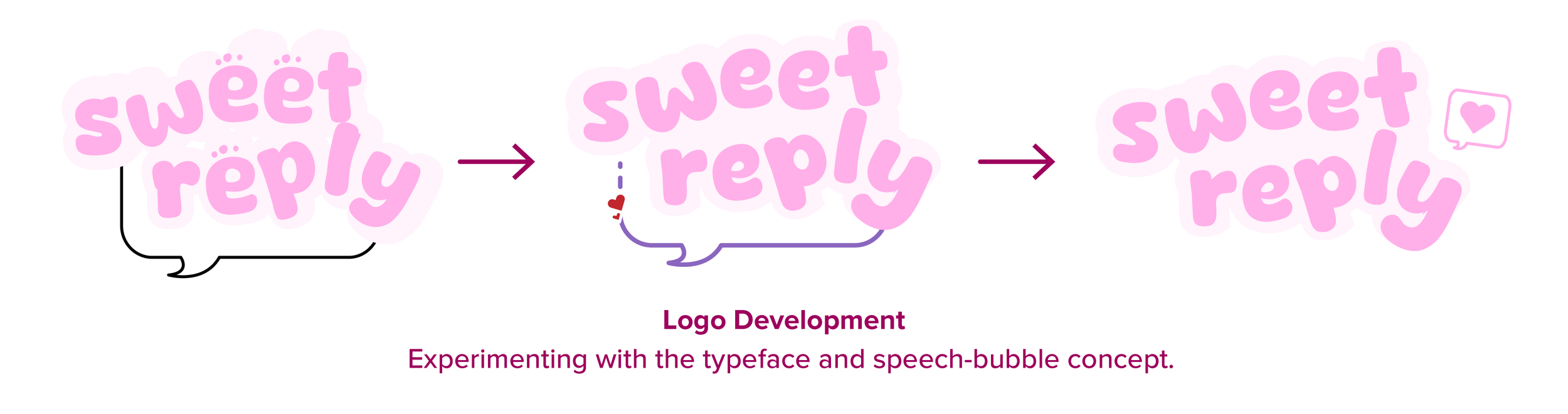
I explored different typographic treatments and ways of incorporating the event's themes of letters, gifts, and celebration into the logo. The identity evolved through several iterations as the lettering, speech-bubble shape, supporting motifs, and colour palette were refined.
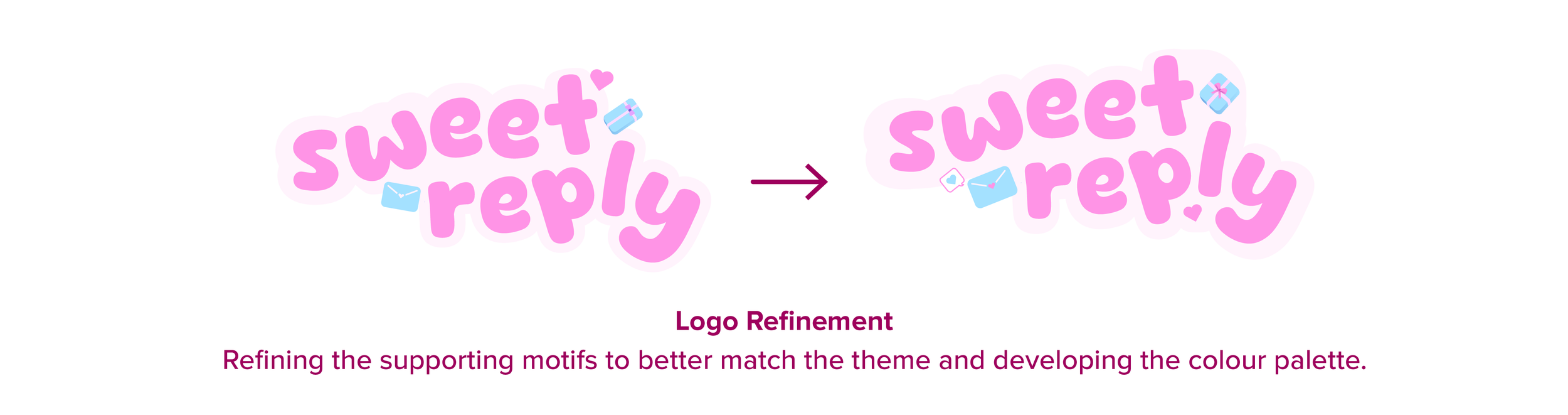
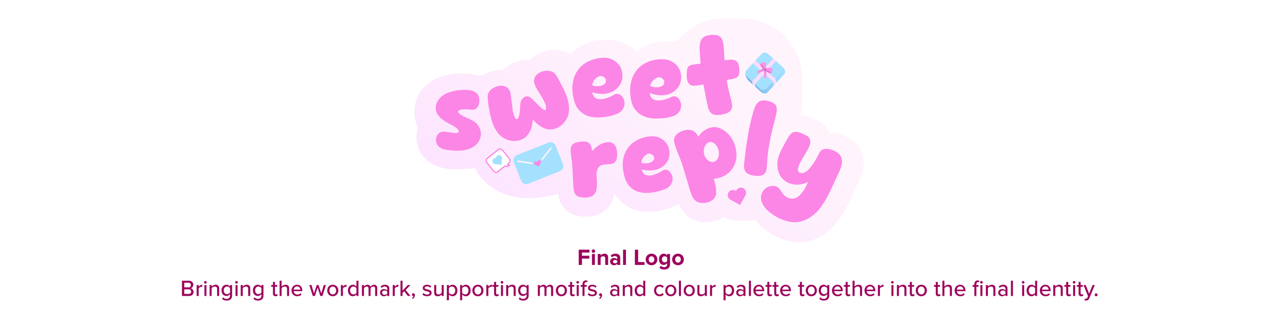
The final wordmark uses bubbly, rounded letterforms customized into an irregular silhouette to create a soft, handwritten quality inspired by a handwritten letter. An envelope, heart, and gift box reinforce the White Day theme and establish a playful visual language for the event.
Colour Palette
A pastel combination of pink, purple, and blue creates a soft, playful, and romantic aesthetic while distinguishing the event from Valentine's Day's traditional red and pink palette.

Brand Applications
With the visual identity established, I extended the branding across digital and physical touchpoints throughout the event, adapting each application to its format while maintaining a cohesive visual language.
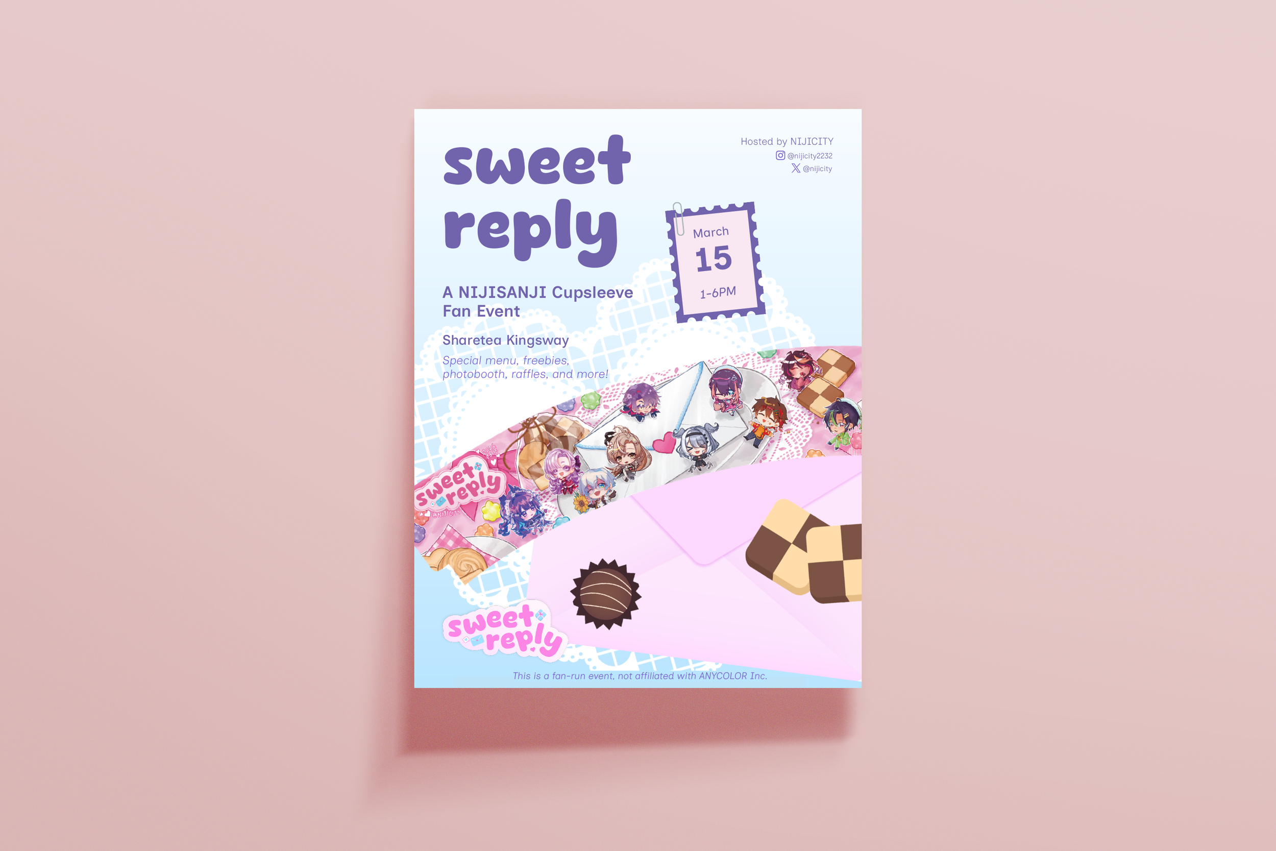
Event Poster
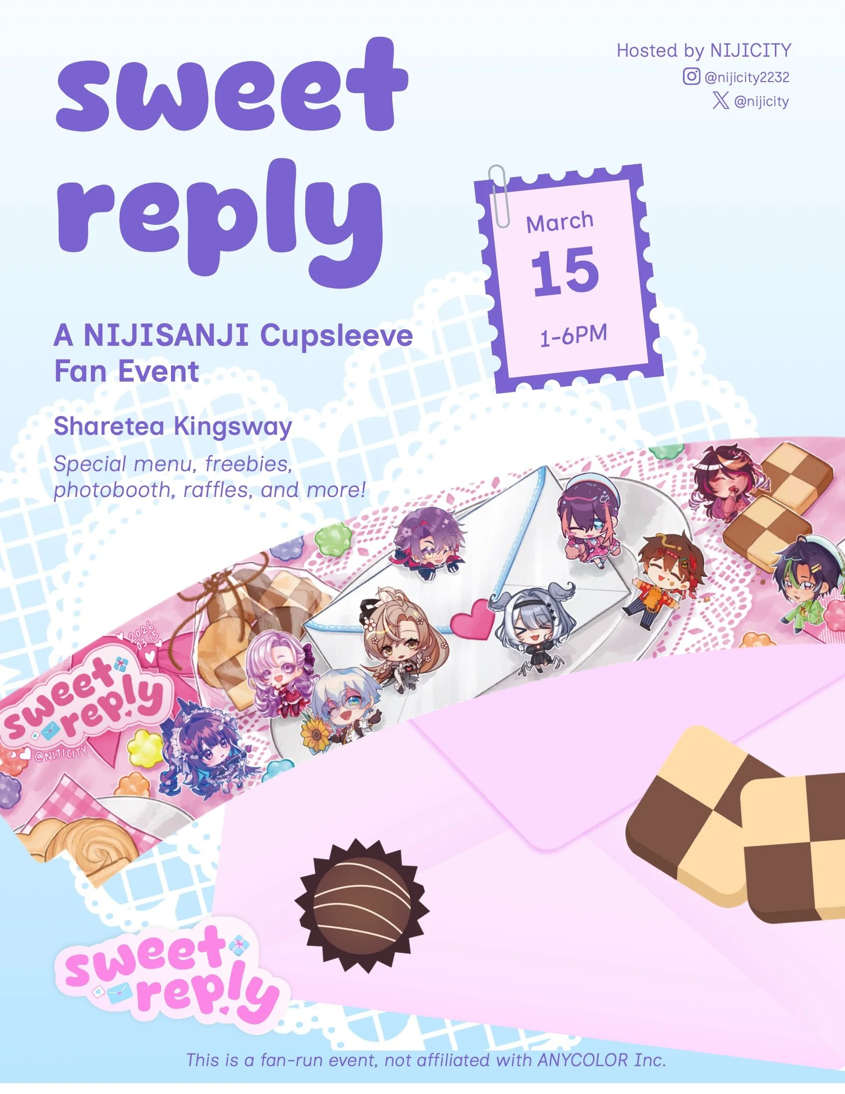
Balanced key event information with the illustrated visual identity to create a clear and engaging promotional poster.
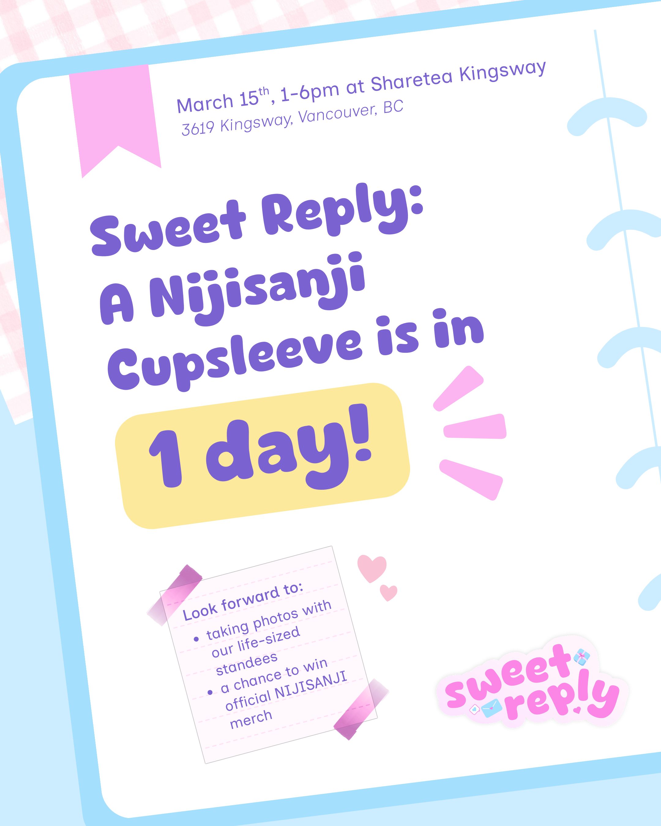
Social Media
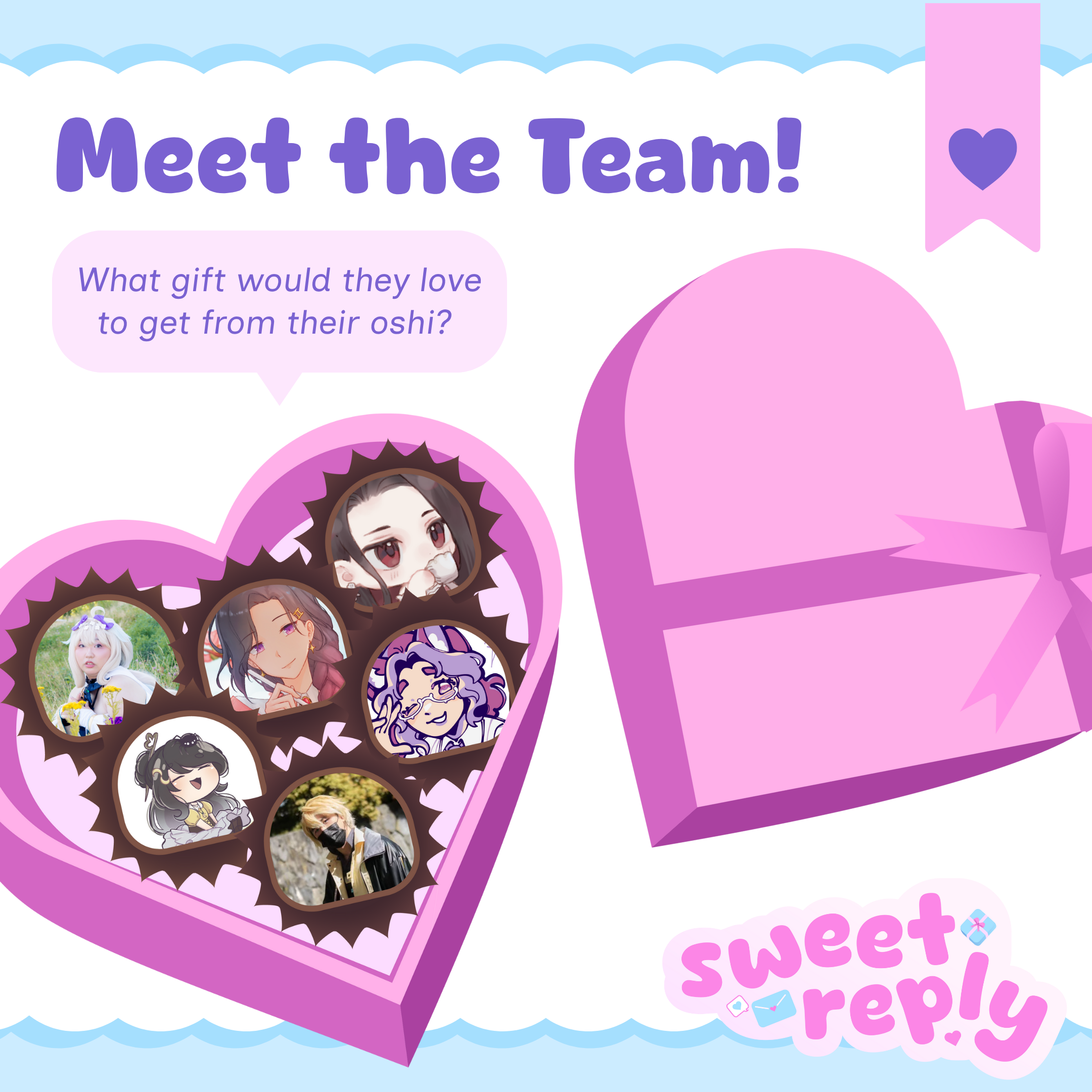
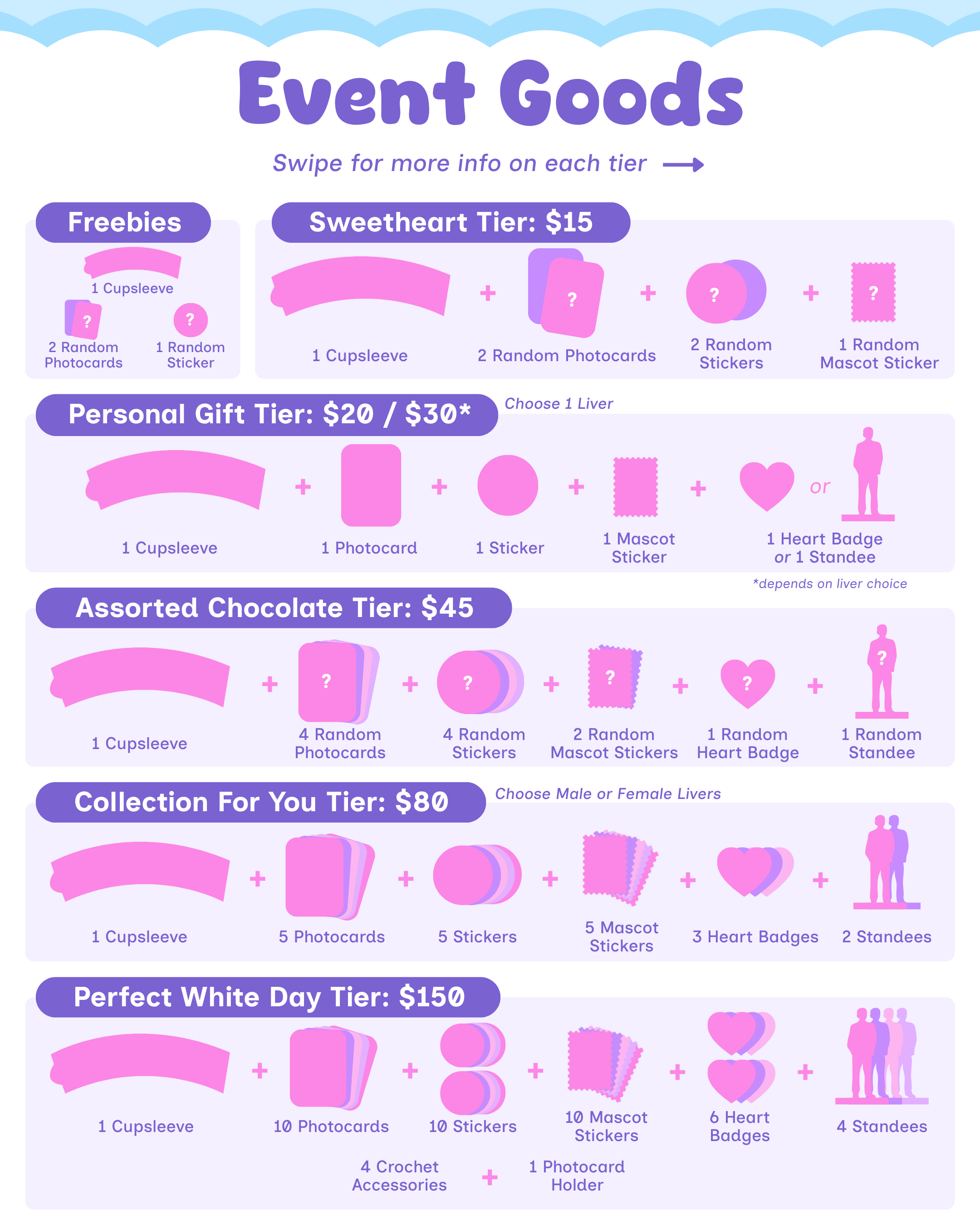
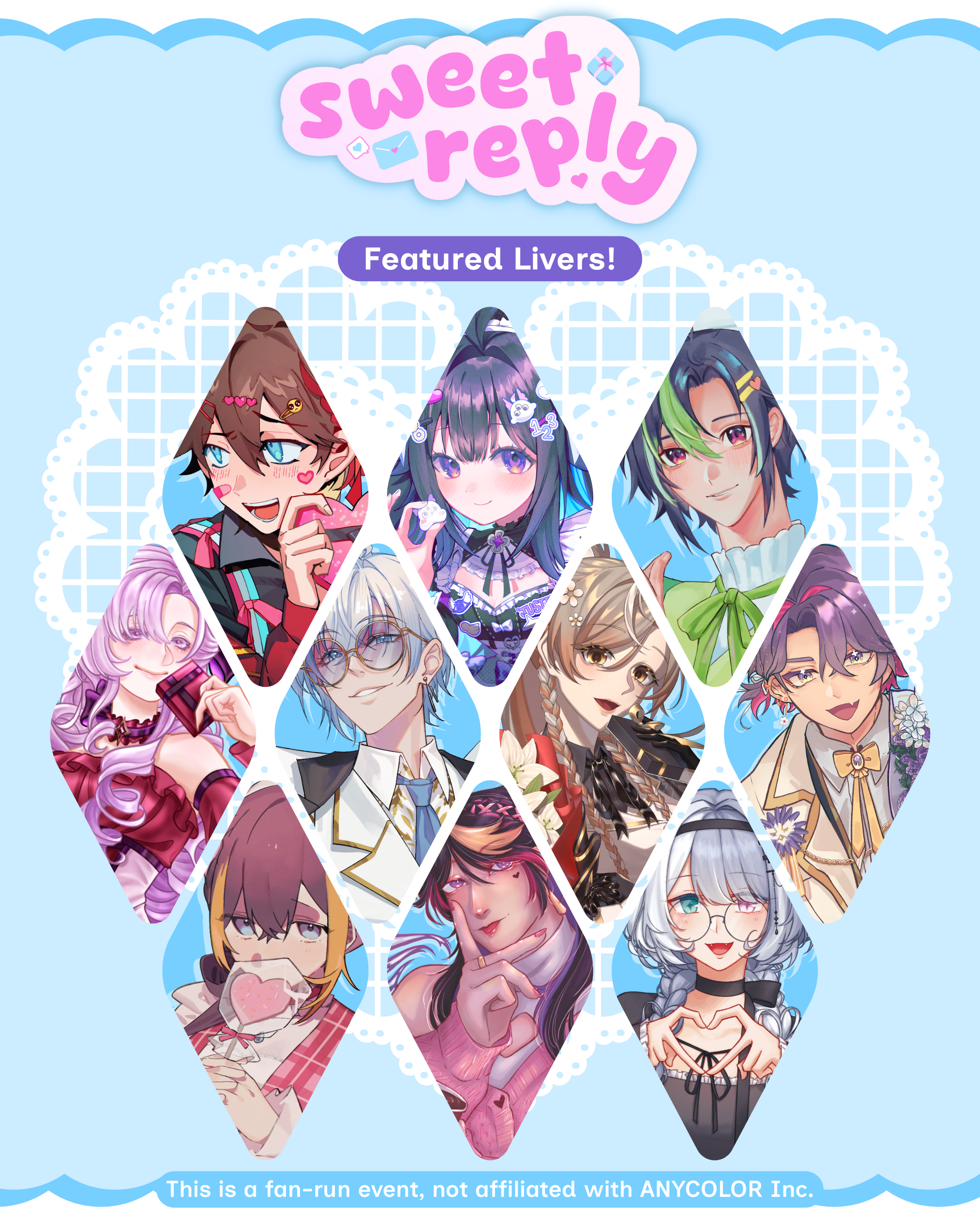
Created a series of promotional graphics, incorporating custom vector illustrations to introduce the event, organizers, featured talents, and merchandise.
Photocard

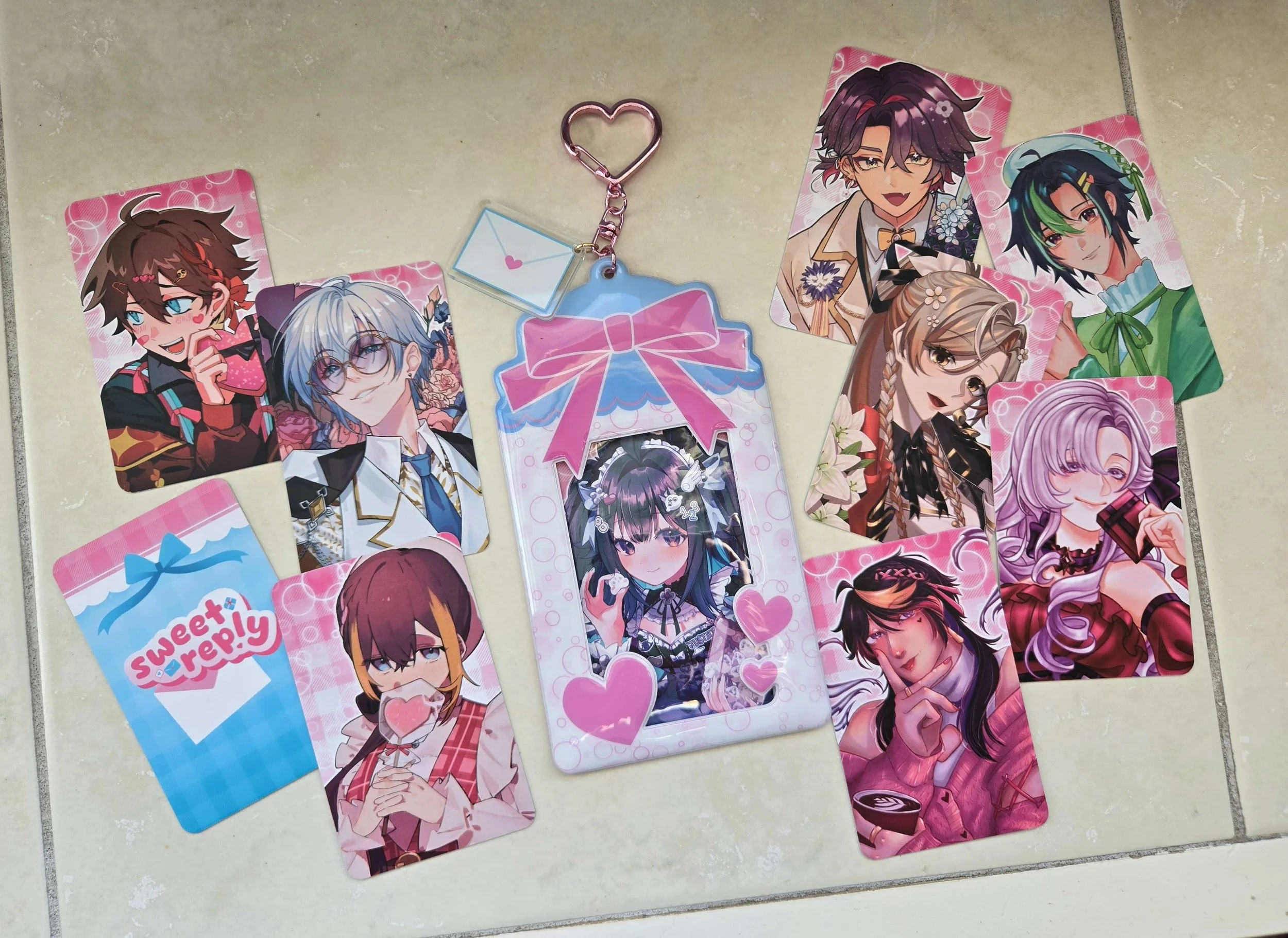
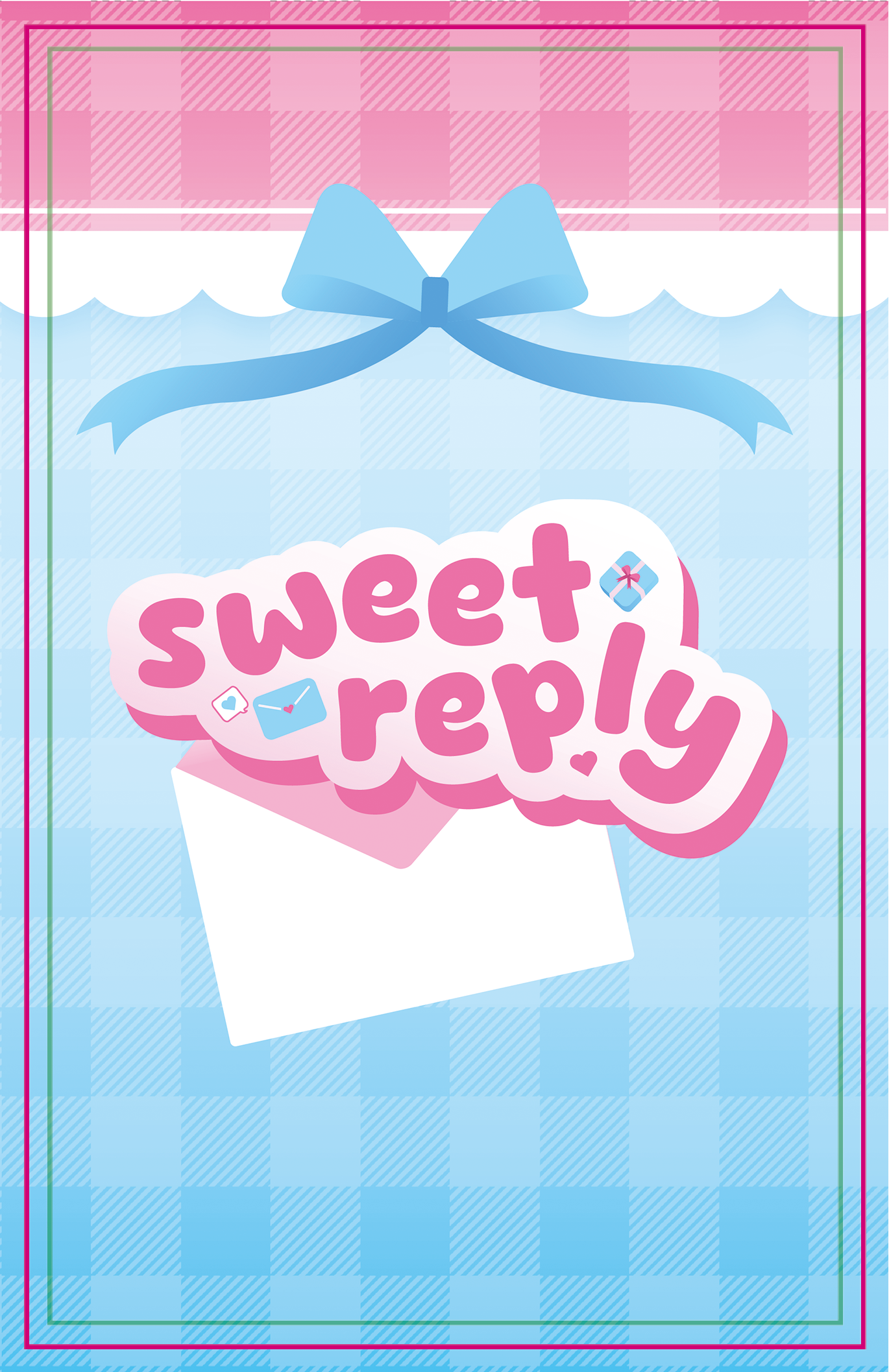
Extended the visual identity to the photocard backing, adapting the branding to a smaller physical format while maintaining legibility and visual hierarchy.
On the left, the photocard backing design with the manufacturer’s bleed and safe areas noted. On the right, the final printed photocards.
Life-Sized Standees
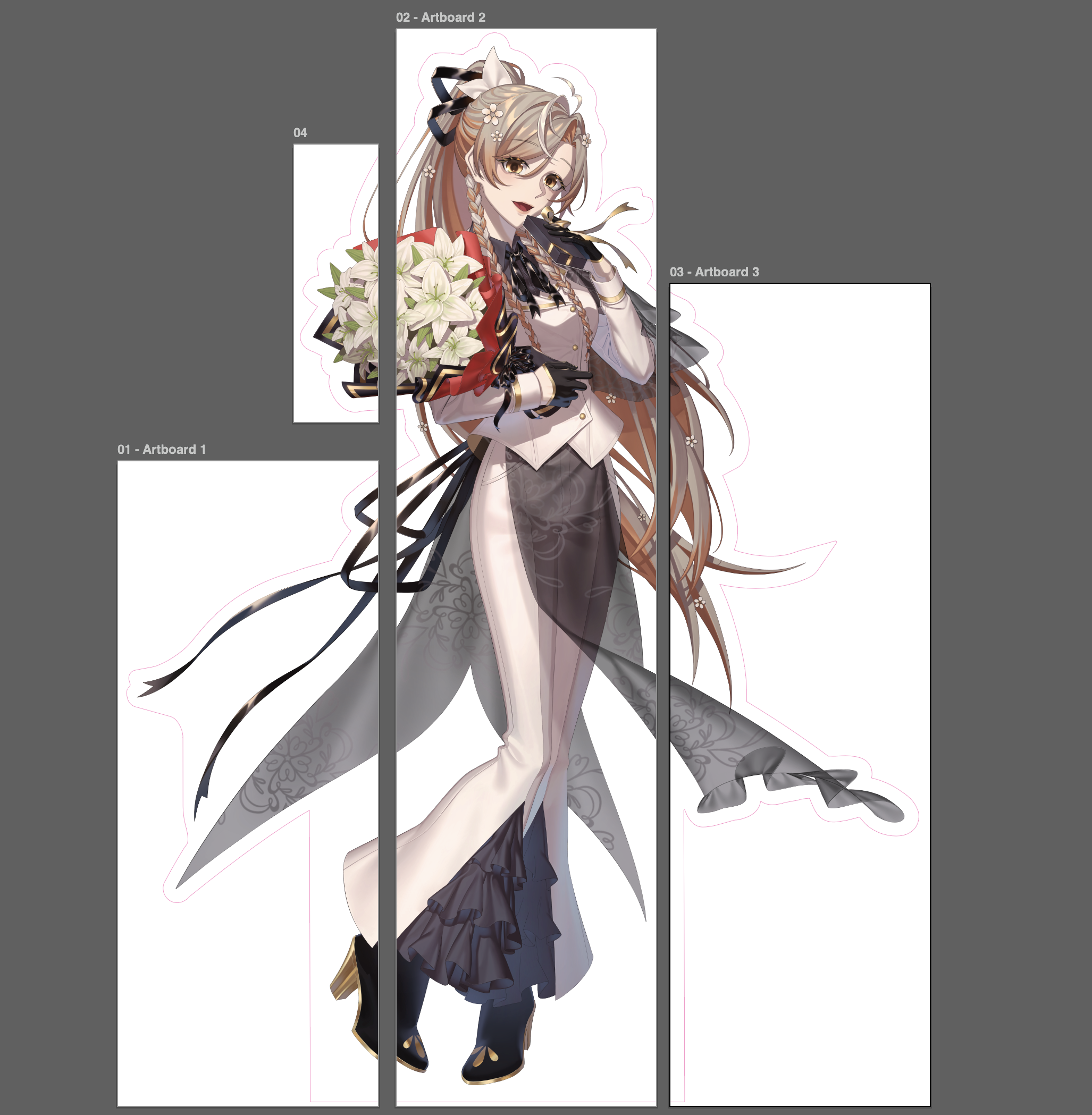
Large-format standees presented additional production constraints due to the size of the artwork. I prepared the files for large-format printing by dividing the artwork into printable sections and creating contour paths for the cutout. The panels were arranged to minimize material waste while keeping the final assembly manageable
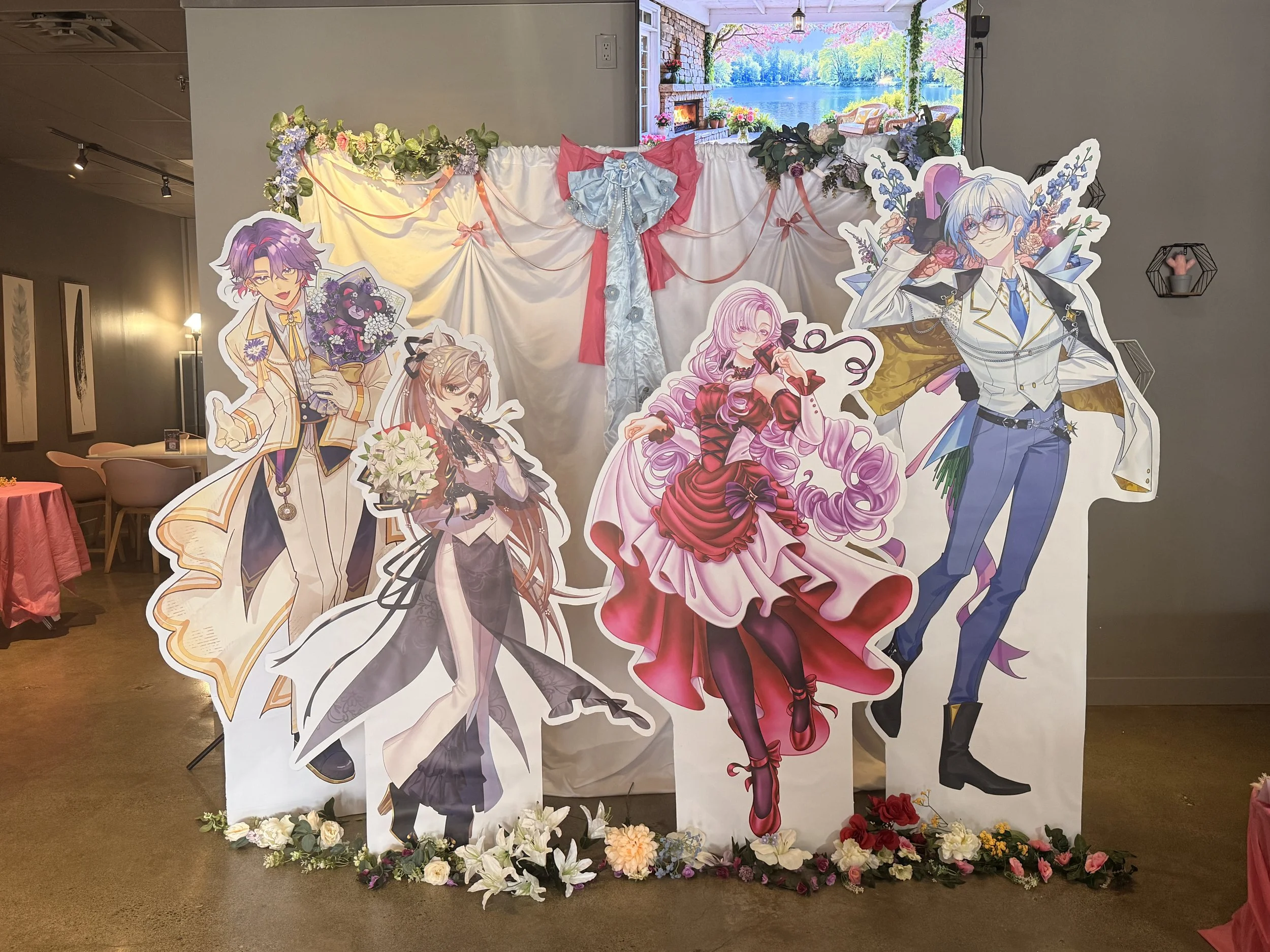
On the left, panel layout optimized to minimize material waste and simplify assembly. On the right, the final life-sized standees at the event.
Reflection
Event planning and design development happened concurrently, meaning the visual system evolved alongside changing event requirements. The experience reinforced the importance of establishing flexible visual guidelines early in a project while leaving room to accommodate new information and production needs. In a future iteration, I would formalize these guidelines earlier to improve consistency across applications and make later design decisions more efficient.
From Screen to Print
I prepared selected event assets for physical production, adapting artwork to different formats and production constraints. This included preparing the photocard backing and life-sized standees for print, accounting for dimensions, bleed, safe areas, and cutting requirements.
Photocard Backing
Prepared print-ready artwork for the photocard backing, accounting for dimensions, bleed, safe areas, and print requirements.